1 August 2014
by Anna Vlassova Longworth
A trip to the Serpentine summer pavilion
Designed by Smiljan Radić, Chilean Architect
Anna Vlassova Longworth has been on a work experience placement with ADF for the last week, helping us out with our project work and generally being a great asset to the team. Anna has just finished her AS levels in English, Classics, History and Art and plans to go on to study Art & Design History in the future. Here she reviews the latest Serpentine Pavilion.
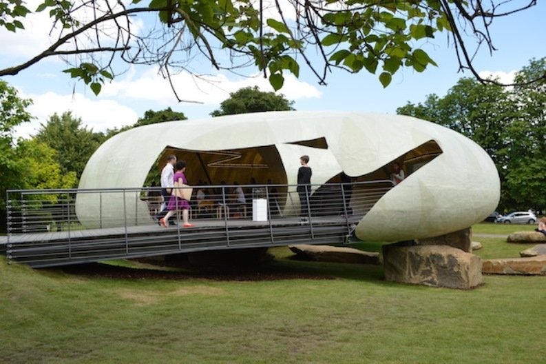
I arrived at the Serpentine Gallery on a sunny Thursday morning to be welcomed by what looked like a giant ostrich egg nestled on a bed of large rocks, this is the site new summer pavilion designed by Chilean architect, Smiljan Radić. The pavilion of 2014 is a stark contrast to last year’s invisible cloud by Sou Fujimoto; Radić’s egg could have landed from outer space. I make my way up the ramp, feeling like I’m about to board some strange space ship out of thunderbirds. The inside is airy but cosy. The golden light that seeps through the tent furthers the feeling of being in an egg shell. The gentle chatter of early morning coffee drinkers scattered around wooden stools and tables make this a sociable space where weary walkers can rest from the sun.
However, while I sat on my stool supressing the temptation to buy an overpriced coffee I asked myself, “do I feel completely at ease in this space?” The answer was no, not completely, the cave was a relief from the sun but I had the feeling that I couldn’t just sit on my stool staring into space for hours. In a way the space felt like it wasn’t supposed to attract custom for long periods of time. The stools were slightly uncomfortable and there weren’t many of them, in fairness this is probably more to do with what the gallery had rather than the architect’s intentions, but it still made me want to leave. I personally only stayed within the building for about ten minutes and the whole time I was there trying to soak up the atmosphere all I could notice was the coffee shop waiters and the gallery attendant staring, wondering why I was sitting on a chair without buying anything.
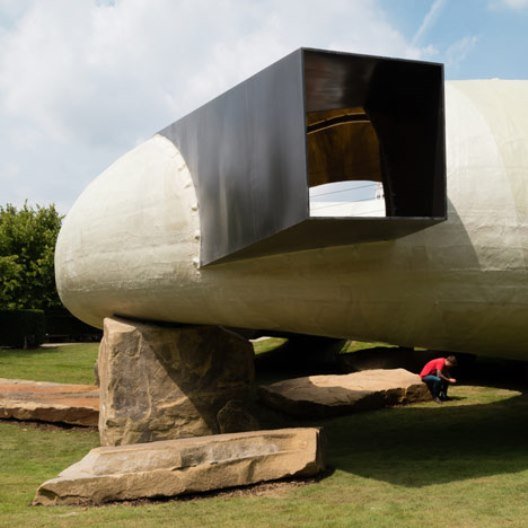
I then made my way underneath the pavilion to explore the outdoor centre piece of the doughnut shaped building. Opposed to inside, you were no longer intimidated by the looming waiters, but now you could be observed from above as I was now doing to the people below as if I was some very important princess waiting to witness a fight between two ancient Greek hero’s. the centre of the structure was open allowing you to peer at the people below as though they were in a lion pit at the zoo. Puzzled by this space, I left the pavilion to sit on a near park bench in order to view it from the outside.
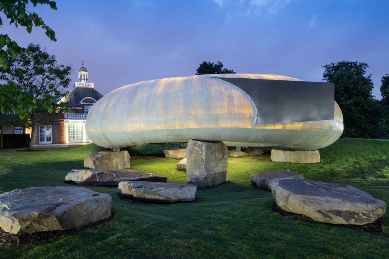
In terms of design I found this pavilion interesting. It seemed both new and old simultaneously. The spherical shape and cream colouring made it seem like an ancient natural feature. However, the placement of the structure made it seem like a crashed space ship. This cross over between design themes is I think what puzzles me most about this pavilion meaning it is not simple on the eye. Radić wanted the pavilion to feel “permanent” and “primitive” by setting it around stone. He was inspired by the Oscar Wilde story ‘the Castle of the Selfish Giant’ which he used as inspiration for a previous design. The original model for the pavilion was made out of paper mashe and masking tape causing Radić to want the finished design to look rough, unpolished and hand-made. By using fibre glass Radić has achieved an odd texture to his pavilion that is uncharacteristic to the normally smooth and glossy material. Radić comments that he wants visitors to see a “fragile shell in the shape of a hoop suspended on large quarry stones. Appearing as if they had always been part of the landscape, these stones are used as supports, giving the pavilion both a physical weight and an outer structure characterised by lightness and fragility”.
Radić wanted people to feel comfortable in the space and at one with the outdoor landscape. I felt this was partially achieved through the translucent nature of the fibre glass, letting in a soft glow, hinting at the heat from the outdoor sun. However, the cocoon shape of the internal space made you feel more hidden from the outside rather than at one with it. In terms of the pavilion as a social space, the addition of the café allows the pavilion to attract people and turn into a hub of activity which is what Radić wanted to achieve. Radić says that “at night, the semi-transparency of the shell, together with a soft amber-tinted light, draws the attention of passers-by like lamps attracting moths.” The pavilion moves with nature allowing it to develop and change as the light shifts. Like a cave, its continual circular shape acts as a shelter, comforting you from the outside world.
Dates that the pavilion is open:
26 Jun 2014 to 19 Oct 2014


