25 April 2016
by Gian Luca Amadei
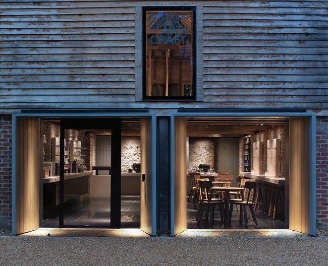
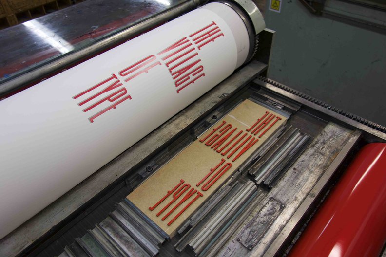
We have partnered with Ditchling Museum of Art + Craft and the Polish Cultural Institute in London to launch a new international design residency, taking place between 30 April - 30 May 2016. This residency forms part of the wider programme of events for the Village of Type celebrations in Ditchling this year.
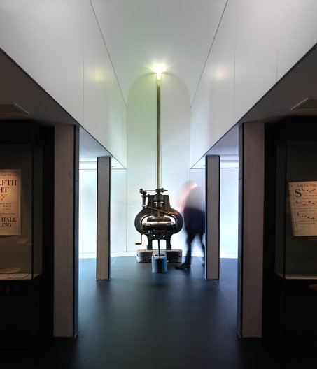
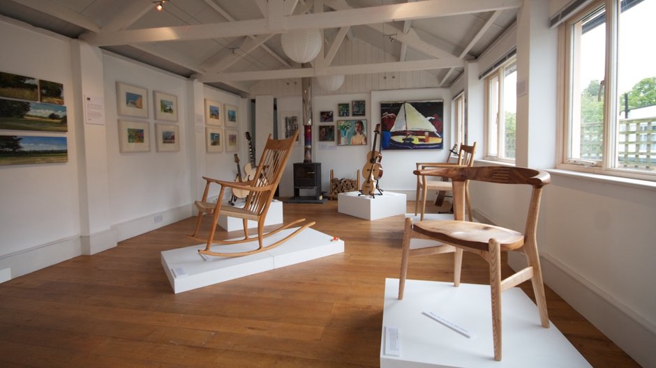
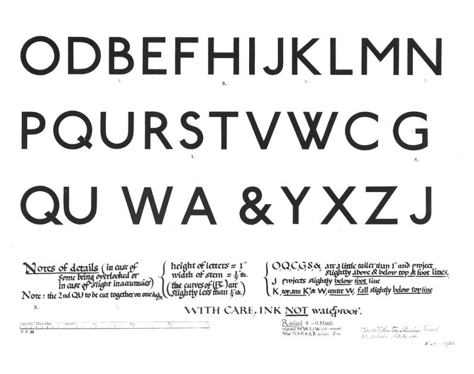
This is an opportunity for a designer to explore the unique collection and archive of Ditchling Museum of Art + Craft, as well as the village's rich history and beautiful surroundings. Ditchling is known for its heritage as a creative hub, where many artists lived and worked, including a number of typographers. This residency coincides with the 100th anniversary of Johnston Sans; a sans-serif typeface by Edward Johnston for the London Underground, which he designed while living in Ditchling.
For this first year of the residency, we focused on Poland, due to the country's extensive and progressive history of typography. After an open call, we invited typographer Viktoriya Grabowska to take up this year's residency in Ditchling.
Viktoriya will explore Johnston Sans in relation to its functionality and accessibility. She will also look more broadly at how typography is used in signage, in helping people to navigate space and how typefaces become part of the visual landscape and identity of a place.
Ahead of Viktoriya taking up her residency, we asked her a few questions:
Tell us a bit about you, what is your background and areas of interest?
I was born and raised in Crimea which I left to continue my education in Poland. I studied Visual Communication at the Academy of Fine Arts in Poznań, where I joined the Type Design Studio as a student and fell in love with typography. Over the years I have developed my interest and skills, specialising in multi-script typography.
What are you working/researching on at the moment?
I work on developing typefaces and I collaborate with other designers and studios, working on various typography projects, often involving Latin and Cyrillic. I also share my love of type with students, teaching at the University of Fine Arts in Poznań and School of Form. One of my recently finished projects is a Cyrillic version of Alpha Headline, a typeface by Cornel Windlin which had been inspired by British car registration plates and is part of the new corporate identity of the ‘Eurosport’ TV channel. Swiss studio, Lineto, is planning to publish these Cyrillic fonts in 2016.
What are you planning to research while on your residency in Ditchling?
When I came to London for the first time, I was pretty much at the beginning of my interest in typography, and I immediately fell in love with Johnston Sans; typeface of the London Underground. It became a strong part of my perception of the city. This experience made me want to explore how typefaces become part of the urban visual landscape, how they are related to the identity of particular place or even particular group of people. I’m keen to learn more about Johnson Sans, to explore this beautiful typeface both historically and aesthetically.
We look forward to receiving Viktoriya's updated throughout her residency!
This residency is supported by Department of Visual Communication at the University of Brighton, the Typography Special Interest Group at Central St Martins and the School of Form in Poland.
For more information on the broader Village of Type programme in Ditchling please click here.
Viktoriya's studio in Ditchling will be open to the public every weekend throughout May, please check times here.
